What’s the difference between a typesetter and a designer, and why does it matter? How should copyeditors prepare text for typesetting? In this post, Rich Cutler gives us a brief introduction to the world of typesetting and design.
The first thing to realise is that copyediting is a game of two halves: editing the content (language, style, fact-checking, consistency …) and preparing the copy for the publication process. Although modern copyediting has changed significantly this century, the latter task (copy preparation) remains vital for most published texts.
Second, copyeditors need to know that a typesetter and a designer are different beasts: ‘typesetter’ and ‘designer’ are not synonyms, though some designers can typeset, and some typesetters can design. The copyeditor should ask their client whether the copy will be going to a designer or a typesetter.
It helps to know the background and evolution of typesetting and design when preparing copy. The two professions are often lumped together but in actuality are very distinct and require different approaches by copyeditors.
A brief history of typesetting
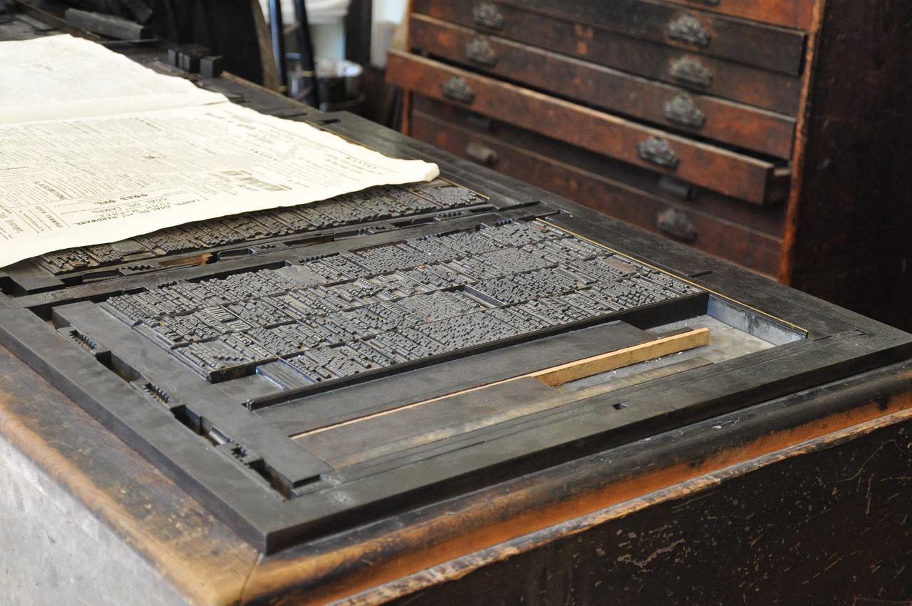
The origins of typesetting lie in printing. Gutenberg’s printing press revolutionised book making in the 15th century by its use of movable and replaceable metal type, which allowed books for the first time to be made quickly and as multiple copies – previously, books were mostly painstakingly handwritten. Early printing houses employed people who arranged or ‘set’ these individual metal characters as words, lines, paragraphs and, finally, pages, ready to print on sheets of paper: these were compositors, later called typesetters.
Typesetting centres on two key principles: aesthetics and readability. A typesetter will arrange text and displayed material (such as illustrations and tables) on a page so that the eye is led naturally from one idea to the next, making sure that the context is conveyed at a glance through careful placement of the elements on a page (eg headings and line and paragraph breaks).
Typesetters are problem-solvers. The ideal layout is not always possible – the perfect placement of, say, an illustration in relation to the design and the sense of the text may result in unacceptable positioning of subsequent material – so compromises are needed to achieve a balance between readability and aesthetics. Authors, clients and proofreaders may grumble about the less-than-ideal location of a figure, but an experienced typesetter will have sound reasons for its placement.
Typesetting has always been a highly technical profession. During Gutenberg’s time and into the 20th century, pages were composed as mirror images of the printed pages by placing metal type with reversed characters in backwards order into a frame. Hot metal typesetting was replaced by a photographic technique – phototypesetting – in the mid-20th century, and a record of the text composed by the typesetter was stored as perforated paper tape. Typesetters were so skilful that they could interpret the patterns of punched holes in the tape as typographical characters and layout. Phototypesetting machines in the 1970s replaced this paper record with magnetic tape, but were yet to have screens allowing the typesetter to see what they were composing.
Preparing copy for a typesetter
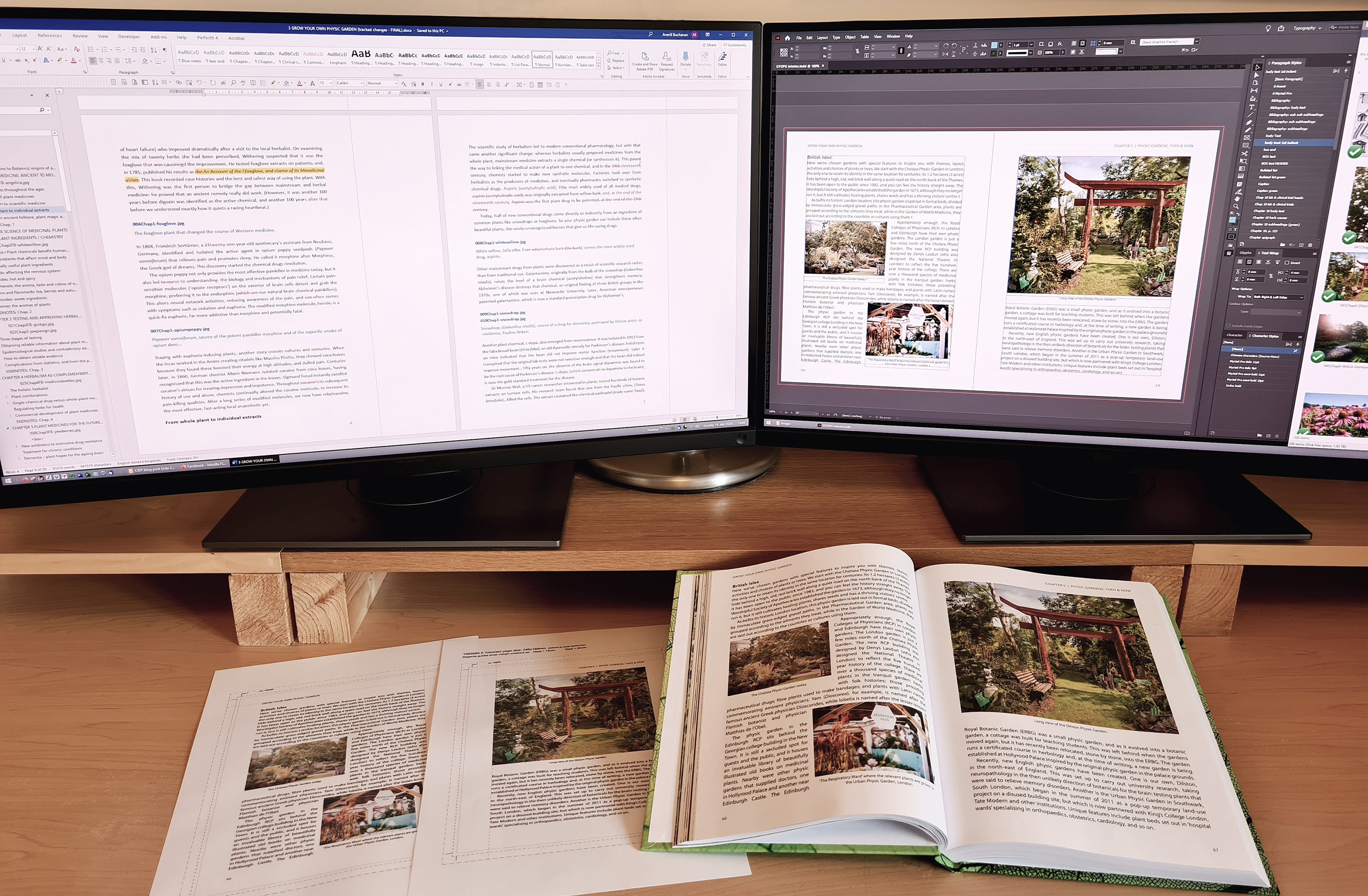
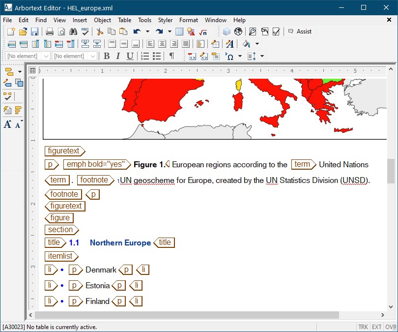
Today, typesetting, like many professions, is done using computers and specialist typesetting software costing several thousands of pounds (the best known being Arbortext). The historically highly technical nature of typesetting is visible in Arbortext and its ilk, which focus on showing the operator the content of a page on screen rather than its actual appearance (see the screenshot) – headings, paragraphs, lists, etc, have arbitrary styles that simply differentiate these items from each other and bear no relationship to how they will appear in print (not unlike Microsoft Word in the early 1980s – before Windows existed!). All text items are assigned tags in a computer language (typically XML) that defines what the elements are – and a master definition file dictates what should be done with these elements, such as their appearance in print and online (which may differ), and whether certain elements are to be hidden in some versions (eg for particular markets).
Typesetters are therefore very computer literate, and are familiar with Microsoft Word, computer code, styles, tags, macros and so on.
So, if a copyeditor provides a typesetter with tagged text, a Word file using styles or even a Word file using local formatting rather than styles, the typesetter should have no difficulty producing proofs with the required layout and appearance.
If the copyeditor wants to make the typesetter very happy – and to reduce proof errors – the copyeditor should
- remove all unwanted formatting and styles that have been applied to the text
- use a tagging or styles scheme only (or perhaps a combination) to indicate appearance
- provide a key to their scheme.
Additionally, the copyeditor should flag anything out of the ordinary or requiring a specific layout or appearance (unusual characters, alignment and indents in, say, a poem, illustrations that must appear together, etc). Using local formatting to indicate the appearance and layout of text for typesetting is not ideal because this unsystematic approach can be ambiguous and unclear.
How designers differ from typesetters
Adobe InDesign hasn’t yet been mentioned. It is a graphic design program, not a typesetting program. Although it can be used for typesetting, it is slow and inefficient compared with dedicated typesetting software like Arbortext. InDesign is aimed primarily at graphic designers: in particular, a breed of designer that appeared alongside phototypesetting.
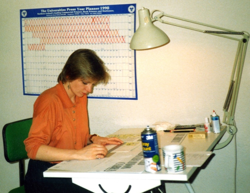
A phototypesetting machine produced photographic paper with an image of text. This could be an entire laid-out page, which was used to make a printing plate. However, the pages of complex publications like magazines or newspapers were easier to create by typesetting blocks of unlaid text, cutting up this text and gluing it (along with illustrations) to a sheet of card. These hand-made pages were then sent to the printer. Graphic designers who did this job were called paste-up artists: they were skilled designers, but did not have the technical focus on type that defined typesetters.
The widespread adoption of computers in the 1980s led to the appearance of desktop publishing (DTP) software aimed at graphic designers working in publishing. DTP software was affordable and easy to use compared with typesetting software, and allowed designers to typeset publications themselves for the first time. The best-known DTP program today is Adobe InDesign.
DTP changed commercial typesetting forever – and divided typesetters into camps:
- those whose lineage is printing
- those with a graphic design background.
To better understand how designers approach page layout compared with typesetters, we need to know a bit about DTP programs: they are the digital equivalent of paste-up – text and illustrations are placed in frames, which can be resized and moved about a page; also, a page will print exactly the same as it appears on screen (not unlike today’s Microsoft Word). A designer’s focus is primarily on aesthetics and appearance, and not so much on the structure and function of text like a typesetter. Most designers therefore have a less technical approach to typesetting, and may not use or understand tags or Word styles – many prefer to copy and paste text into InDesign, to deliberately lose all styles and formatting, then manually reapply styles and formatting in InDesign.
All typesetters work in a similar way, but the same cannot be said for designers: the copyeditor needs to find out how the designer wants text prepared. Some designers may be happy with a tagging or styles scheme, others prefer to copy and paste and then manually apply formatting. Some designers doing the latter may be efficient at spotting and transferring formatting, others may be more hit and miss, so highlighting formatting such as italics and superscripts for them can help.
About Rich Cutler
 Rich Cutler began in publishing as a desk editor for STM publishers – first at Pergamon Press, then Harcourt Brace Jovanovich. He later became a freelancer and co-owner of Helius – a business that has been providing bespoke services to publishers for three decades, including development editing, copyediting, proofreading, project management, illustration, graphic design and typesetting. Rich is an Advanced Professional Member of the CIEP. He is also an occasional lexicographer, and helped to write the Collins English Dictionary and the Oxford Dictionary for Scientific Writers and Editors.
 About the CIEP
The Chartered Institute of Editing and Proofreading (CIEP) is a non-profit body promoting excellence in English language editing. We set and demonstrate editorial standards, and we are a community, training hub and support network for editorial professionals – the people who work to make text accurate, clear and fit for purpose.
Find out more about:
Photo credits: letters by Jirreaux, printing press by Mari77, both on Pixabay, Arbortext by Rich Cutler.
Posted by Harriet Power, CIEP information commissioning editor.
The views expressed here do not necessarily reflect those of the CIEP.